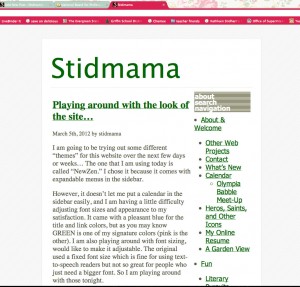
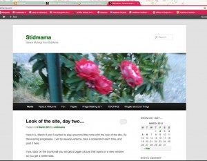
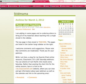
Here it is, March 6 and I wanted to play around a little more with the look of the site. As the evening progresses, I will try several versions, take a screenshot each time, and post it here.
If you click on the thumbnail you will get a bigger picture that opens in a new window so you get a better idea.
The theme I am trying out today (and I like it a lot!) is the WordPress theme for 2011. It has many options, the fonts scale nicely although I might change from the san-serif font it came with to something more like a Georgia (my current favorite). I put a picture of the roses by the front door from several years ago as the header for the screenshot, but will be alternating it with a picture of my boys at Mt. St. Helens — nothing like volcano in one’s backyard to remind us to enjoy and hold dear every minute! And a picture of me a few years back (a little blurry), and one of my family that I like. I like the drop-down page menu under the header picture, and the drop-down categories in the sidebar. What do you think?
Here is the theme that I keep going back to…
NewZen using the hex color # 006600 for the title and links


Leave a Reply